MyRISD App Redesign
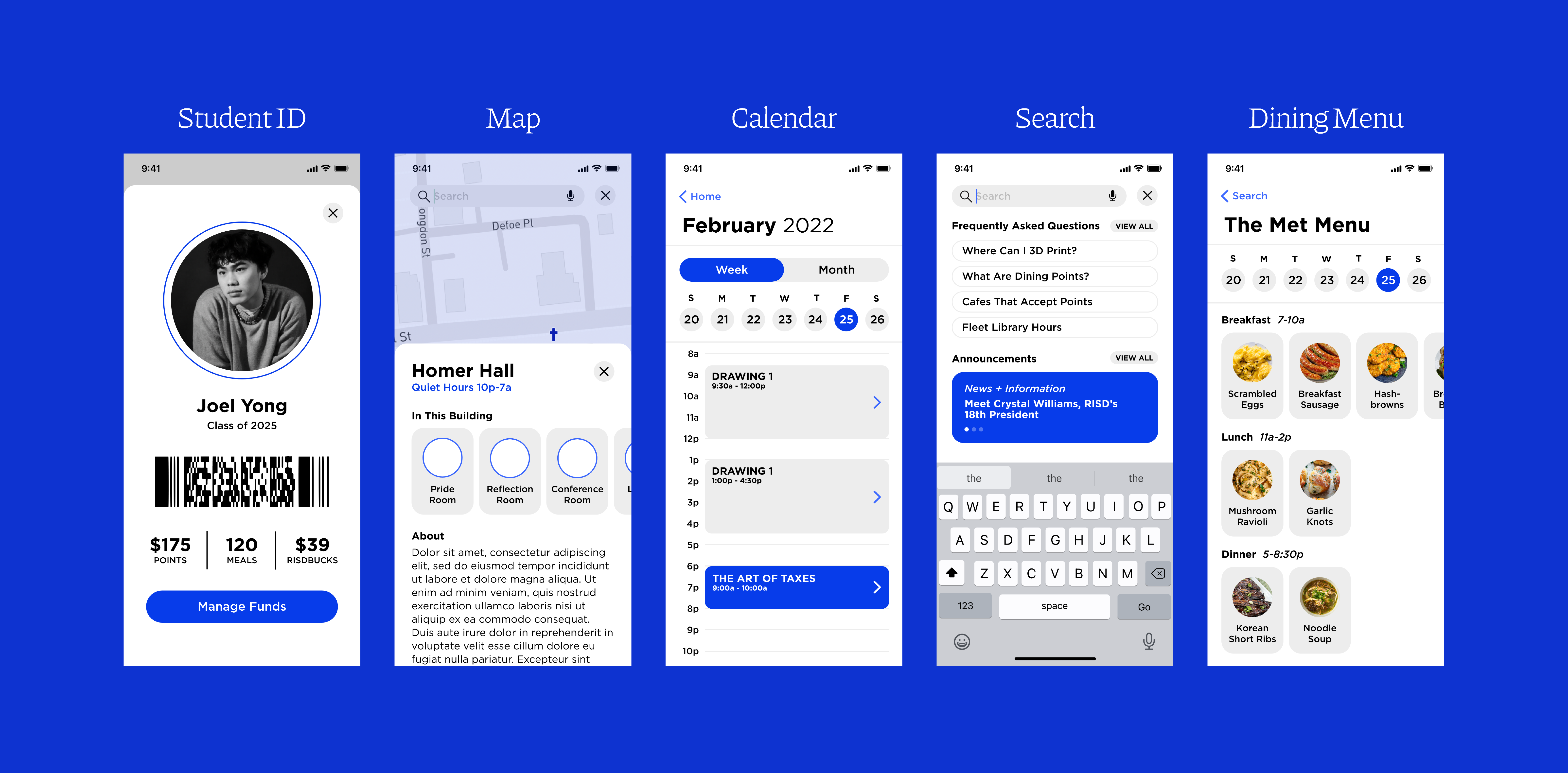
Project Brief. Redesign the existing MyRISD app to create a simple and functional tool for students to use on a daily basis. Students, staff and community members should be able to access useful, personalized information without the distraction of third party sites and buried information.
Year
2022
Role
UI/UX Designer
Category
UI/UX
Status
Concept
2022
Role
UI/UX Designer
Category
UI/UX
Status
Concept


Primary Issues to Address

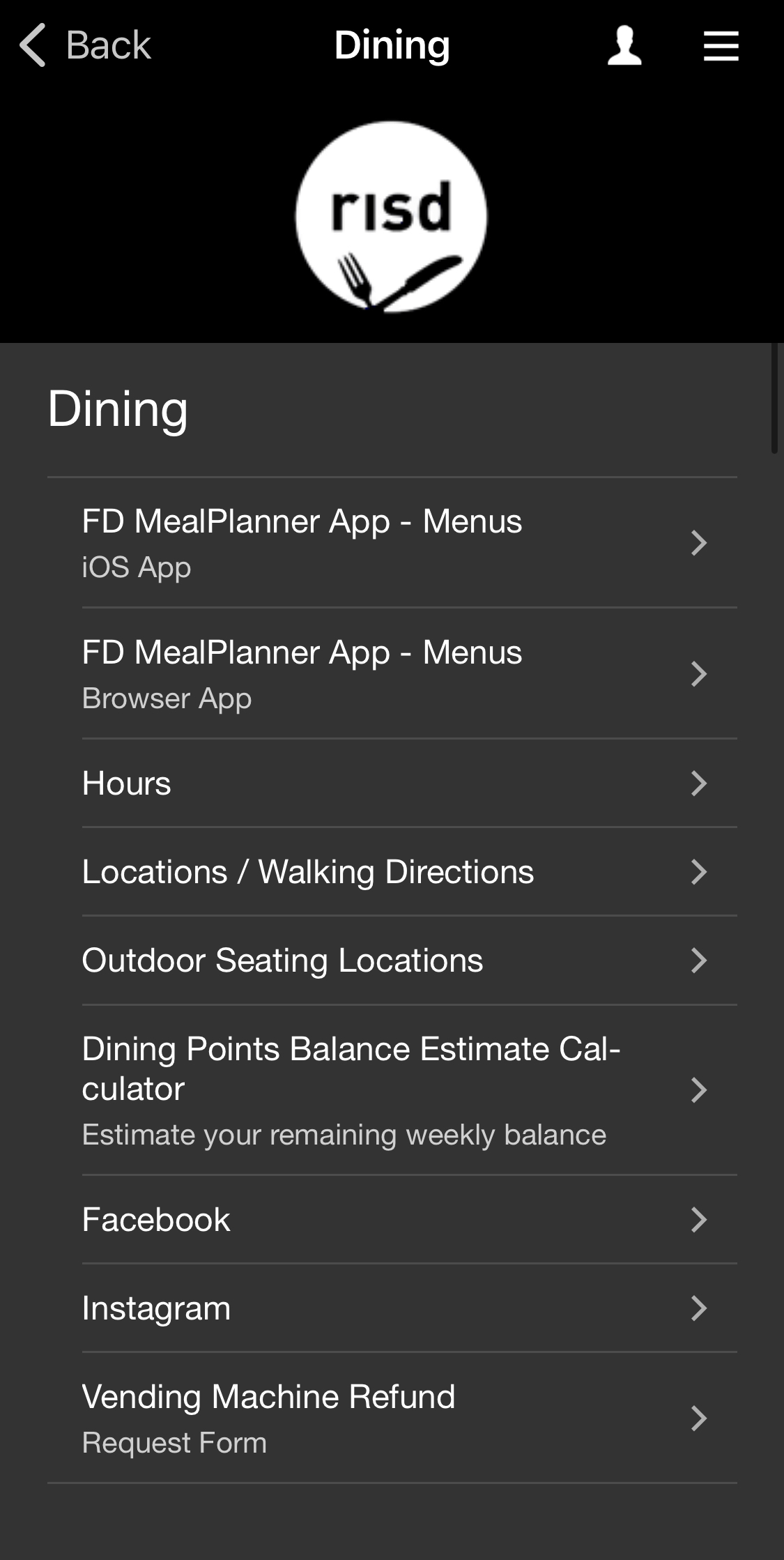

- Complex and unintuitive organization system on home page.
- Information overload in sub-menus.
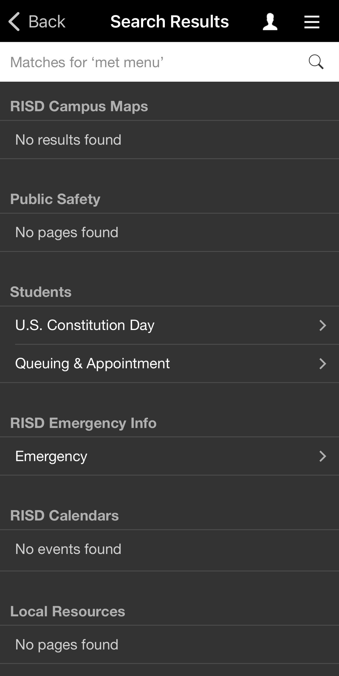
- Confusing search interface—cluttered layout and limited functionality makes it very difficult to find relevant information.
- The app frequently redirects users to other websites for basic functions.
Design Drivers



Organizing Structure
An intuitive interface grounds data/ information in the context of the real world. All of the app’s core functions can be grouped into the categories of TIME or SPACE. The redesign will center around these two central metaphors.
TIME = Calendar
SPACE = Map
SPACE = Map
User Stories
Nicole. “Nicole wants to head back to her dorm safely late at night so she uses the map feature to check if she is in the vicinity of any nearby RISD Rides. She proceeds to quickly submit her ride request and is able to consistently check the location of the ride as she waits. She gets home safe and sound.”
Jake. “Jake wants to find a place to 3D print for a project, so he searches “where can I 3d print” in the MyRISD search bar. The results include all of the RISD maker spaces that have 3D printers on the RISD campus, as well as an interactive map to make finding the spaces easier. His 3D print turns out great and he has a great crit.”
